Multimodal LLMs are models that can process and understand different types of data, including text, images, and audio. This makes them ideal for understanding the meaning and purpose of UI elements, which are often a combination of text, images, and interactive elements.
TLDR – we can understand UI elements by looking at an image
– try it out in the playground app
– read the post on how to fine-tune miniCPM yourself
On a high level, these are the steps used to understand a UI element.
- Gather data about the UI element.
This may include screenshots, videos, and descriptions of the element’s functionality. - Choose a multimodal LLM.
There are several multimodal LLMs available, such as OpenAI’s GPT-4v and Google’s Gemini Pro.
The larger ones are generally quite expensive and slow and trained on a large dataset with a large variety of content. - Finetune the model
To get better results, and to be able to use faster and more affordable models, we finetune models to be better at this specific task. In this case, we’ll focus on MiniCPM-v – a smaller, multimodal model, possible to fit into a single GPU for inference. - Prompt the LLM.
The prompt should describe the UI element and ask the LLM to explain its meaning and purpose. - Use the output.
The LLM will generate a response that explains the UI element’s meaning and purpose.
Here is an example of a prompt you could use:
Given a screenshot of a UI element, explain its meaning and purpose.
The UI element is a button with the text "Add to Cart" next to an image of a product.
The LLM might generate the following response:
The "Add to Cart" button is a call to action that allows users to
add a product to their shopping cart.
The button is typically located next to the product image
and is designed to be visually appealing and easy to find.
When a user clicks the button, the product is added to their cart,
and they can continue shopping or proceed to checkout.
Multimodal LLMs can be a valuable tool for understanding the meaning and purpose of UI elements. By following these steps, you can use multimodal LLMs to improve the usability and user experience of your applications.
But since you don’t know what the element is showing, we need to be more vague in our ask to the model. We can then provide an image as well, send in this prompt, and the image:
Given a screenshot of a UI element, explain its meaning and purpose.
Be concise, only reply with what the element does in a UI context.
The LLM might generate the following response:
The element is a "Add to Cart" button.
It allows users to add a product to their shopping cart.
Better – but not great, in our use case we need to understand what product will be added to the cart – for that to work we need to give even more context.
Send this prompt, the image, and the context
Given a screenshot of a UI element, explain its meaning and purpose.
Be concise, only reply with what the element does in a UI context.

Take this context into consideration when responding:
Context: {parsedContext}
The LLM might generate the following response:
The element is a "Add to Cart" button.
It allows users to add the Nike Air Force - $199, to their shopping cart.
The Problem
Understanding UI elements on websites can be challenging due to ambiguous icons, complex visual hierarchies, and multiple similar elements. We experimented with various approaches to tackle these issues, using both visual and textual data.
Experimenting with Different Approaches
1. Visual-Only Models:
Initially, we tried models that focused solely on visual data. These models struggled with context-specific icons, like a trash can that could mean different things in different parts of a page. Visual cues alone were insufficient to disambiguate these elements reliably.
2. Textual-Only Models:
Next, we tested models that relied purely on textual data, such as HTML and CSS. While these models understood the structure and semantics from the DOM, they failed to grasp the visual nuances, such as the prominence of certain elements based on their size, color, or placement.
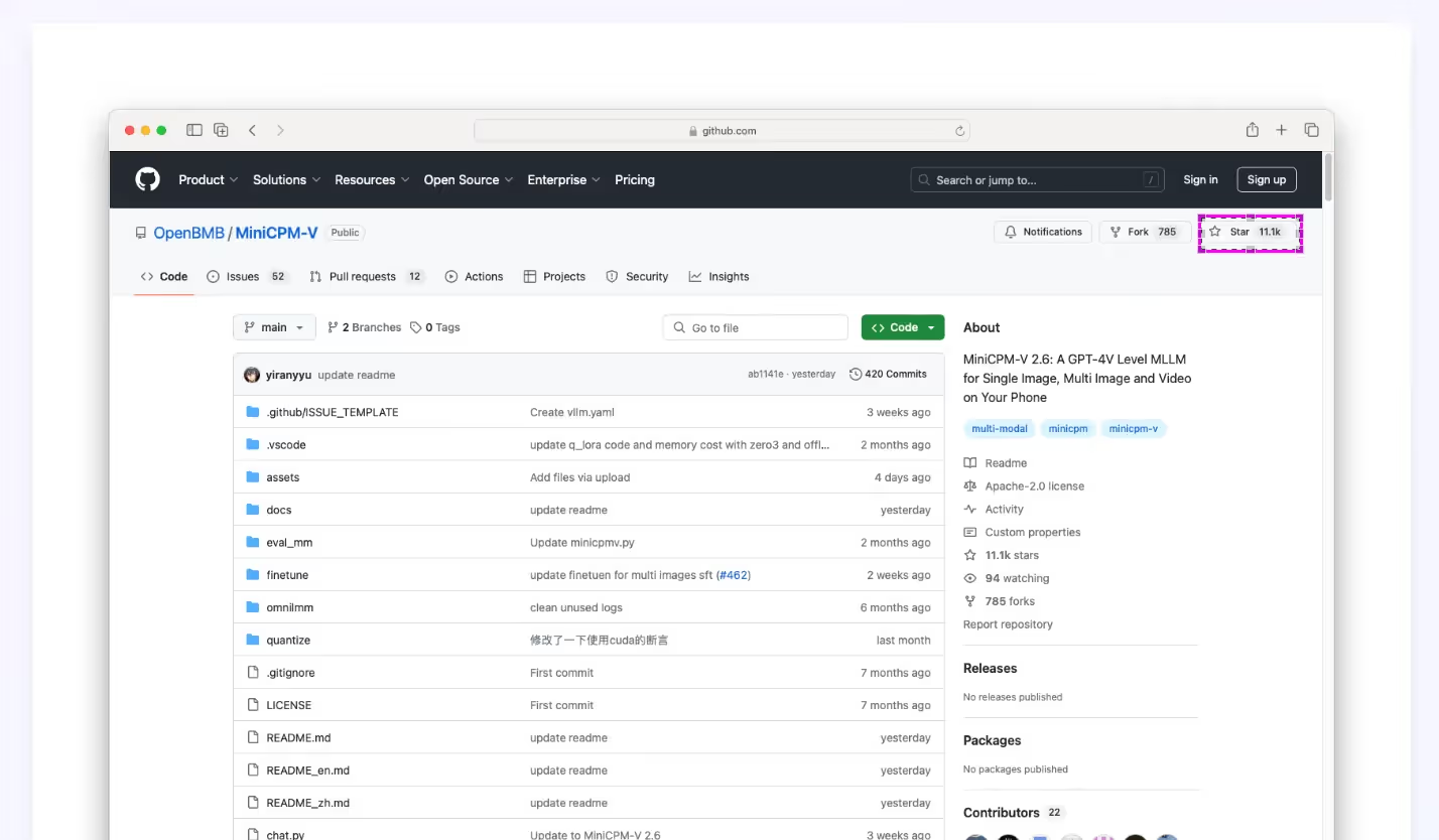
3. Multimodal Approach with MiniCPM-v:
We fine-tuned MiniCPM-v on a dataset of 10,000 annotated UI elements, combining both visual and textual inputs. This multimodal approach proved most effective in our evaluations. The model could interpret icons in context, understand the visual hierarchy with the help of DOM data, and differentiate between similar elements by analyzing both their visual attributes and surrounding text.
Key Benefits
– Context-Aware Detection:
Icons are correctly interpreted based on their visual and textual context.
– Better Visual Hierarchy Understanding:
Integrates DOM data to decode the importance and relationship of UI elements.
– Accurate Handling of Similar Elements:
Differentiates between identical icons used in different contexts, like multiple trash cans in a table.
Finetuning of MiniCPM-v
To not get too technical, we split out the how-to section into its own article – see “How we Fine-Tuned miniCPM to Understand Web Interfaces”
Conclusion
Our experiments showed that a multimodal approach using MiniCPM-v is the most effective way to detect and understand UI elements on websites. By leveraging both visual and textual data, we achieved greater accuracy in interpreting complex web interfaces.
Playground
