Consistent Testing Across Every Screen Size
Our customers told us testing applications across various device screens can be cumbersome—so we simplified it. Introducing Device Presets, a streamlined way to manage device-specific testing effortlessly.
Why it matters:
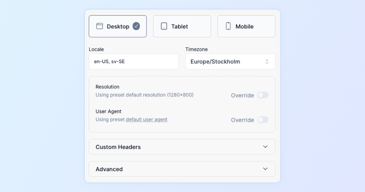
- Accurate Device Simulation: Quickly test your app with common presets for desktop, tablet, and mobile—complete with resolution, user agent, locale, timezone, and custom headers.
- Simple Prioritization: Device presets automatically follow a clear hierarchy—from test case revisions, through test cases and test plans, down to your project defaults.
- Centralized Management: Create, customize, and manage your presets directly from your project settings. Keep consistency across your tests while maintaining flexibility.
Preset Highlights:
- Easily select from popular resolutions like 1280×800 (desktop), 768×1024 (tablet), or 375×667 (mobile).
- Customizable locale, timezone, and HTTP headers—no more juggling manual settings for different scenarios.
- Built-in defaults and clear restrictions ensure optimal test execution speed and reliability.
Testing with different device viewports is now as simple as selecting your preset—ensuring your applications deliver a flawless experience on every screen, every time.